
Google Phone App Redesign Draws User Backlash
Google Phone App Redesign Sparks Mixed Reactions
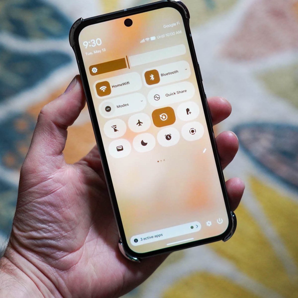
Google has rolled out a major redesign of its Phone app under the Material 3 Expressive update, but the new look has left many Android users divided.
The update introduces a cleaner, more modern interface with significant layout changes. The “Favourites” and “Recents” tabs are now merged into a single “Home” tab, making it easier to access frequently dialed contacts and recent calls. The floating keypad button has been replaced by a fixed tab at the bottom center, while the dedicated “Contacts” tab has been removed. Instead, users must now use a three-dot menu at the top to search for contacts.
Another noticeable change is the way users answer or reject calls. They can now choose between a horizontal swipe or a single tap under the “Incoming call gesture” option in app settings.
The redesign is part of Google’s wider Material 3 Expressive rollout, which also includes updates to Gmail, Google TV, and Google Clock. It is currently available for users with the 186 version of the Phone app.
However, the sudden changes have sparked backlash on social media. Many users describe the new interface as “blocky,” “oversized,” and “confusing.” Some say the update disrupts their calling experience and are actively looking for ways to return to the previous design.
For those unhappy with the new layout, Google still allows a rollback. Users can revert by either:
Go to Settings > Apps > Phone > Storage, then clear the cache and uninstall updates.
Opening the Google Play Store, searching for “Phone by Google,” tapping the three-dot menu, and selecting Uninstall Updates. Restarting the device completes the process.
While Google says the redesign is meant to reduce accidental call actions and improve usability, the company is expected to issue further guidance soon on layout preferences.

Mutib Khalid is a skilled content writer and digital marketer with a knack for crafting compelling narratives and optimizing digital strategies. Excel in creating engaging content that drives results and enhances online presence. Passionate about blending creativity with data-driven approaches, Mutib Khalid helps brands connect with their audience and achieve their goals.